Blurry or non-blurry is a matter of taste.
Blurry makes sense for log-in screen, but one way or the other, you've got non-blurred version too.
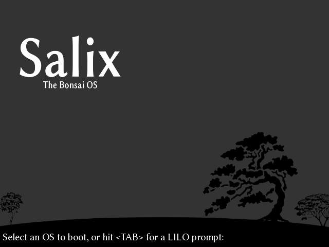
"The second bump (hill) to the right" however, brings us to the
actual problem of many otherwise fine distributions:
They all insist on using the
logo on boot, on log-in and on the desktop.
That's completely wrong in my eyes.
And it ain't necessary.
These logos do nothing technically but are destroying the art ...
It's up to you to consider my wallpapers as the art or not, but the point here is that any image gets destroyed by logos.
On the other side, it feels like somebody would try to force me to identify with a distribution I'm using.
I always disable Fedora logo extension or 'photoshop' it out on all other OS.
Apple and Windows don't use wallpapers with logos neither.
Salix-gray would make a good boot-screen.
And ... it's easy to recolor.
Talking about Salix log-in screen, "the second bump (hill) to the right" is needed for the logo.
Please check these examples:
https://ibb.co/Z2z74Zh
https://ibb.co/jD0QrHr
https://ibb.co/yRh1RpJ
https://ibb.co/vs9tyRR
As of mmolch-xfce, the most important part is xfwm.
It can be well combined with adwaita (flat) and adwaita-colors.
It's that window-frame that brings most for that 'flat-look' which makes 'modern'.